💼 Business Tools
Explore AI-powered tools designed to enhance your business posts, campaigns, and social media presence.
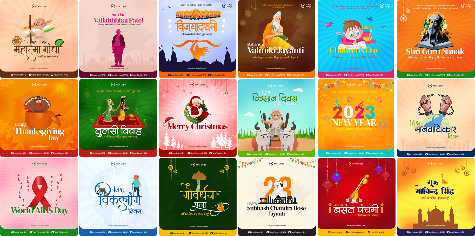
Festival Post Generator
Upload your logo or image, select the festival theme, and generate vibrant, ready-to-share social media posts instantly. Perfect for businesses and brands!
- Quick and easy-to-use interface
- Add company names, logos, and festive greetings
- High-resolution download for social media
- Compatible with Instagram, Facebook, LinkedIn & WhatsApp

Ad Generator
Create professional ad creatives in seconds! Upload your product images, choose templates, and generate ads optimized for social media campaigns.
- Multiple ad templates for Instagram, Facebook & LinkedIn
- AI-driven text suggestions for higher engagement
- Download high-quality visuals for campaigns
- Fast and user-friendly workflow